San Francisco Bay Guardian is planning a year-long anniversary celebration, starting with a strikingly different look. In the Jan. 11 issue, Executive Editor Tim Redmond calls the new design "both far more modern and in keeping with the historical mission of this newspaper." The Bay Guardian was founded in 1966 by Bruce B. Brugmann and his wife Jean Dibble; Brugmann is still the editor and publisher, and Dibble is the associate publisher. The paper has also re-adopted its original logo; Redmond says the move demonstrates that the vision Brugmann and Dibble had "when they started the Guardian is still what we're about today: Printing the news and raising hell."
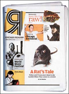
Predictability took a tumble at the Chicago Reader Sept. 17 when the paper adopted a fresh new design. Freelance writer Nora Ankrum tells the story behind the 33-year-old paper's transformation, accomplished through a collaboration between the paper's staff and Spanish design firm Jardí + Utensil. While some readers may miss the old Reader, advertisers say they like the way the new look captures readers' eyes.
Chicago Tribune media critic Steve Johnson weighs in on the Chicago Reader's recent redesign, writing, "Suddenly a publication that looked a little murky and, perhaps, vulnerable, has a new air of vibrancy." Next year, Time Out New York is scheduled to launch its Chicago edition, which will compete directly with the Reader by publishing comprehensive entertainment listings. Reader editor Alison True tells Johnson, however, that the redesign wasn't prompted by Time Out's imminent arrival. "A paper that takes 12 years to redesign doesn't make impulse decisions," she says. (Free registration required.)
The Chicago Reader will hit stands on Thursday, Sept. 16, with a colorful front page and new layout, marking its first redesign in 12 years, reports the Chicago Sun-Times. Rather than feature the text of the lead story, the new front page will read vertically and be highlighted by color photos and art above the fold. An advertisement will be below the fold. The paper's inner sections will also get front-page makeovers to prominently feature week-at-a-glance calendars and critics' picks. Editor Alison True tells reporter Eric Herman that the goal of the redesign was to put "a lot more information on the covers."
Following an industry trend, the Arizona alt-weekly went down to 25 inches wide, from 27. At the same time it rearranged sections and added more music coverage, editor Jimmy Boegle announces in a special anniversary issue. Although columnists will be allotted 150 to 200 fewer words, the theory that readers don't like longer articles is "full of crap," Boegle says, and word counts in most news and arts stories will remain the same. AAN associate member Katherine Topaz of Topaz Design did the redesign.
