Editor’s Note: This is the 11th in a series of “How I Got That Story” interviews featuring the winners of the 2005 AltWeekly Awards. First-place entries are collected in the book “Best AltWeekly Writing and Design 2005.”
Perhaps you haven’t heard of Rick Sealock, but you probably know the Canadian artist’s work, if not from the pages of alternative weeklies, then from a magazine, greeting card or maybe even the side of a bus graced with his googly-eyed "Got Milk?" cows.
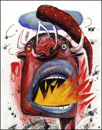
His illustrations, which are as often of animals as of humans, can be recognized by their distorted images; by their menacing teeth, baggy eyes and big nostrils; and by what Sealock rightly describes as a "manic energy." In spite of that, his color palette is typically subdued: a range of reds, browns and blues that lend weight to his work, adding a layer of seriousness to what might otherwise seem like straight-up comedy.
This year Sealock won two AltWeekly Awards, taking first place for Illustration in both circulation-size divisions. His cover illustration for Sacramento News & Review nailed the main story’s central message with a depiction of U.S. Rep. John Doolittle as a kind of sinister octopus, sprouting heads of crony statesmen from the tips of his legs. For Reno News & Review, Sacramento’s smaller sister paper, Sealock took on a different kind of monster: the "Best of" issue. He filled that perennial alt-weekly staple with colorful characters — a cocktail waitress, a gambler, a tourist — that playfully capture both the city’s culture and the spirit of celebrating what Reno has to offer.
Sealock has been illustrating for almost 20 years, usually working in some combination of pen and ink, watercolor, acrylic and collage. For the last 12 years, he has taught as well. He currently splits his time among his studio, Sheridan College, and the Ontario College of Art and Design. In spite of his busy schedule, he squeezed us in to discuss the importance of art, animals, politics, ugly images and the human condition.
What kind of illustrator are you?
I fall into the category of the somewhat quirky illustrator. A set standard of illustrators out there, like Ian Pollock and Gerald Scarfe and Ronald Searle and Ralph Steadman, fall into that category. We all get sort of the same kind of assignments.
And what kind are those?
Mostly editorial assignments, but they’re usually political in their stance, or making a social/economic statement. One of the covers I won an AltWeekly Award for was a political criticism, and the other one made fun of the standards of today’s society.
What is the connection between your style and the stand you take?
I think I make ugly images that make beautiful ideas happen. But I love drawing bad, ugly pictures that seem to make sense. It’s hard to describe it now that you put me on the spot. I have no idea. It’s just what happens happens.
 Rick Sealock, self-portrait 2 |
So you don’t necessarily have an agenda?
Never an agenda. My art comes of my being a troublemaker, a political underdog who wants to see justice, or wants to see those who are unjust brought into the light, and to illustrate them in the right light.
History repeats itself. George Grosz is a German illustrator from the 1920s and ’30s who drew these ugly images of German politicians before Hitler, and he described it as drawing "what they are, not what they look like." And I think that probably hit a chord when I started illustrating, and I followed that somewhat ornery-manner approach to illustration.
Your work includes a lot of distorted views of humans and animals. How did the animals get in there?
When I started illustrating 20 years ago, nobody was using animals like that, and you try to market yourself or brand your image, create a style. I grew up on a farm, and I actually taught myself how to draw by drawing animals. The cows, the pigs, the rats, the other animals, all seem to substitute for human personality. So I’m using the old language of personification that has been around quite a while.
Tell me a little bit about how you come up with a concept for an illustration.
There are two approaches. One, the art director already has an idea and you follow that, and you try to express his idea using your own method.
But most of the time I get free rein, where I think, "Okay, what is the basic character of this story? Is it human suffering, which means, could it lead to life-or-death situations, and is that good or evil?"
So I try to go for the human equation with an illustration: how it affects you. If it’s funny, the illustration should make you laugh. If it’s serious, the illustration should make you reflect on it, be introspective, whatever. I more or less give the viewer a chance to be part of the illustration and hopefully take what they can from it. I try not to tell them exactly what’s going on but just give them a direction to start to consider. So the idea is always to be the instigator.
 |
How did you come up with your ideas for the Reno "Best of" issue?
I started out by doing a few sketches for the art director, Dave Jayne, to show the possibility of how it could go this way or this way or this way. All of a sudden the sketches opened up these doors, which opened up other doors. It became like a snowball rolling down the hill. We started adding more images and looking at it from different points of view.
At first, we were only going to illustrate certain topics, but then after a while we had all these visuals we could use for all the topics within the issue. We decided to keep it fun, get the viewer to look at it, enjoy it, but then start to think about it and consider whether there might be a secondary message.
What kind of secondary message?
I was sort of making fun of society in the way I drew these characters: the gambling monkey, the sexy waitress, the uppity cow waiter, the awkward-bodied pool visitor, the obese Elvis impersonator. So on a secondary level, the images could start a dialogue on issues like overeating, gambling addiction, exploitation of women, consumption, over-political correctness, neglected children, etc.
 |
And how did you develop your concept for portraying Congressman Doolittle for the Sacramento story?
The art director at the time, Andrew Epstein, knew he wanted to get across this idea of this guy being somewhat of a political beast, and he was like, "Well, his fingers are in everything. He’s in every cookie jar. He’s controlling things, so he’s a puppet master." All these visual terminologies, cliches, metaphors were being thrown around. And the idea of the octopus, where he’s kind of human/not-human, started to work out and then became the idea of a puppet master with the faces all around him. So everything clicked into this over-enlarged image of the political beast.
The two of us would throw ideas back and forth. He would go, "Oh no, make it worse. Make it uglier," and I was like, wow, nobody tells me to make it uglier. I was enjoying it.
Did you read the story to prepare for doing the illustration?
I read a couple of paragraphs, and I was just like, ugh, c’mon, this guy’s a beast. So I started coming up with the worst sort of image we could play with. Taking into consideration you can only do so much. You can’t draw naked, child-eating killing machines and stuff like that and get away with it. So there are certain levels of respect, but I think we got away with the idea that he looks as fake as you can possibly get.
So, you’ll draw some sketches, you’ll show them to the art director É
And the art director sometimes confers with the editor, depending on the story, what kind of content it is, if it’s going to affect the paper or in some cases get them in lawyer trouble. That happens once in a while, but yeah, most of the time there’s a verbal discussion that becomes a visual discussion over sketches. Sometimes there will be changes to the sketches if they’re a little too racy or too political. You have to be sensitive. You don’t want to be outrageous and push it to the limit just to do it.
So the process from conception of an illustration to completion varies depending on the publication and the deadline they’ve given you, I guess.
Yep. It also depends on how much meat and gravy there is to that illustration in the sense that a politically charged issue or something that has human consequences — whether it be good things or suffering — gives you more visuals that you can choose from as compared to, for example, an illustration about buying a new pair of shoes.
What’s the difference between illustrating for a newspaper vs. a magazine?
Newspapers are the last outlet of political expression. Most of the magazines I have worked with have all become quite conservative or fallen off the map. One of the reasons I’ve kept my foot in illustrating the newspaper and newsweekly stories is they allow for some freedom of expression. Newspapers have done so much political imagery, and they’ve always kept illustrators alive doing that. They don’t pay a lot, and they’re not a huge marketplace, but they allow people the chance to exercise their artistic arm and make statements that a lot of places won’t allow us to make.
When did you notice magazines were becoming more conservative?
Since the new leadership of America took over, magazines and newspapers have had a major change in attitude about expression. I’m not sure if it’s because of the corporate ownership of a lot of these media outlets, or if it is because of political reasons or pressures. I’m not the only one noticing — I have fellow Canadian and European illustrators who’ve just gone, "What has happened?" It’s like the door has been slammed. I noticed right away that my work dropped about 30 percent.
Have you noticed any kind of shifts like that with alternative weeklies?
Because they’re a little bit off on the fringe and don’t have the heavy hand of the corporate world on top of them, they have a little bit more leeway on this. And they probably have more liberal readership. I think that is probably why I still get work from them.
Do you otherwise have a steady stream of work, or does it always go up and down?
It goes up and down depending on the issues of the day. Certain issues are easier to write about at certain times. If you’re talking politics, there’s always a lot more demand for anything that deals with poverty or money or helping out. When the government is playing its — I don’t want to say "playing its games" — but it’s doing a certain amount of doubletalk and those issues come to light, that’s when people go, "Come on, we have to do something about this."
How do you navigate satisfying your own goals without getting too far afield of what your editors expect?
It’s a constant back and forth. In terms of what you can get away with, each client has been different. A lot of times when clients do ask me to do work for them, they’ve looked at my Web site. They have an understanding of all the different things I’ve gotten away with for imagery, so they kind of know that they’re going to be going down that pathway too. Often, I have a lot of freedom before I even start the job that some other illustrators may not have because of the imagery that they use.
Sometimes I’ve had to repaint over certain things, where it’s like, "No, we can’t have that steaming dog poo happening on the guy’s foot," or whatever, like, "That statement is out." There are certainly things that visually are not acceptable. But you keep pushing and you keep trying. If you can push the ugliness of humanity enough, people let you get away with that. What illustrators draw and how humans behave are two separate things. I don’t think I’ve ever drawn anything as bad as it’s really happened in nature or in life.
Do you have any parting words of advice for art directors and editors on how to get the best work from the illustrators they hire?
You don’t want to write that. [Laughs.] The best art directors are the ones who research the illustrator and look at their images, see what they’ve done before and how they’ve done it. They allow whatever illustrator they hire to do what they do best. I’ve had art directors who have loved my work, and then they keep changing the image until I’m thinking, well, why didn’t you just draw it, because it looks like something you would have done, not what I do.
I don’t mind expressing their ideas or researching possible ideas like theirs if that’s part of the process, but I just don’t want to be called to draw a certain thing and then try and make it look like what they would paint. Some of the best editors/art directors have always allowed me the freedom and worked with me — and excitedly — to keep pushing that viewpoint, going, "Let’s see what we can get away with." They were looking for their challenges as well, so together we’re producing some amazing work. They allow me to be who I am, and they allow me to get away with stuff, so they’re instigators. They’re bad people, too.
Nora Ankrum is a freelance writer who lives in Austin, Texas, where she proofreads for The Austin Chronicle.
