In February, Washington City Paper was a runner-up for “World’s Best Designed Newspaper†from the Society for News Design—a rare accomplishment for an AAN newspaper, and the only U.S. newspaper this year so recognized. Designers Carey Jordan and Jandos Rothstein discuss the accomplishment and the work that led to the recognition.
Jandos Rothstein, Creative Director: We’ve been asked to talk a little bit about how Washington City Paper came to be a finalist for World’s Best Designed Newspaper, and whether we’ve learned anything along the way that other AAN papers could use to create more engaging pages.
Carey Jordan, Art Director: We were honored and surprised by the recognition, and very hopeful for a few days that we would go all the way. I should say first, that the award category recognizes the entire staff, and I think that’s fair, our photographer and our writers do a lot each week to help make the paper visually engaging.
JR: One of the things the judges said was that a lot of newspapers have great covers but are doing fairly rote design work on the inside. That line explained to me why we were in contention. When I redesigned the paper a couple of years ago, we introduced what the staff all refers to as “grazersâ€â€”pages that are unassigned to a regular writer and that we try to use for non-linear storytelling. We now have three—one for hard news, one for arts and one for food. Those pages probably get the most time and attention after the cover and the feature story. We also do a lot of packages that lend themselves to varied and visual layouts.

CJ: We don’t always succeed at being non-linear on the grazers, but when we don’t we’re at least breaking out of our usual beats and bringing unusual topics to the paper. I think the readers appreciate that—oh, but I should also add a shoutout for our food editor Jessica Sidman. It helps that food is such a naturally visual topic, but she’s really embraced her grazer and does a lot to consistently find small, engaging stories that can be told in visually driven ways, or as charticles.

We also do a what we call “toppers†little extra stories or web refers that are often illustrated. It all means there are not that many pages where all we’re doing is dropping in a handout photo and flowing text.
JR: Yes, Jessica is great coming up with those, and our editors Mike Madden and Jonathan Fischer have done so much encourage visual thinking among the whole staff. The other thing that I think needs to be said (though I guess it’s obvious since there are two of us talking—though maybe not obvious why it’s important) is that while we have less than two, we have more than one full-time designer working on editorial. A lot of AAN papers [including Washington City Paper, for several years] have dropped down to only one, which you can do, but not without compromises.
When City Paper’s design was brought back in house after being in Creative Loafing’s Atlanta office, our Publisher Amy Austin and then Editor Mike Schaffer made a decision to invest more in the appearance of the paper. Amy in particular wanted the ability to do “format busters,†which we now also do quite a bit. And, when you have two designers working on the issue the day before press, you can just be ambitious in ways that you can’t if you only have one. I earn most of my income teaching. But, I think it’s worked out all around—because I’m part time and because Carey is massively talented but in her first real design job—between us, City Paper ended up getting a lot of firepower at only a bit more than a single senior-level designer would cost.

CJ: You have some talents too—you’re better at branding and large project design and management than I am.
JR: I got some game, but when I think where you are compared to when I was your age, well, I don’t think the 20-something version of me much compares to you. But I think that does raise an interesting point: I think we really got lucky with how we worked out as a team. When I hired you, I already liked you and knew you, but I don’t think I could have anticipated how compatible we would be working together.
CJ: What’s been hardest for me is figuring out whether an idea will work before I try it. You’ve been able to help me edit myself, and pull some of the extra weight when I take on a something that’s maybe a bit too ambitious.
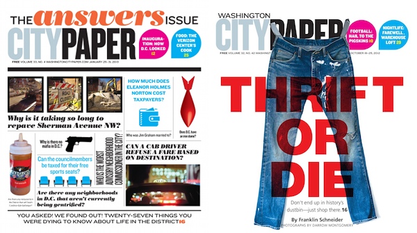
JR: One of our two individual winners at SPD this year was the cover for “The Gay Issue.â€

You were already very oriented towards making stuff by hand, but I had shown you Marian Bantjes’s work, and you drew a little inspiration and decided to execute the title in Rainbow Glitter. The results were stunning, but it took all day. It helped that I’m fast enough to have banged out most of the other pages. We have a fabulous, award winning and long-term staff photographer—Darrow Montgomery—he’s covered the city for 25 years, and he always enterprising and inventive—but the consequence of that is we rarely have much budget for illustration that isn’t photography. A big change for me since you’ve come is I don’t miss the absent illustration budget nearly so much when you’ve taken the lead on projects like executing the “bear†type in hair, or the way you are sometimes able to use stock in a way that doesn’t betray its origins.

CJ: You’ve done some nice illustration—the beer issue…that fabulous decision tree the food truck issue….

JR: I tend to run to Photoshop or Illustrator, I just like that “by hand†is now an arrow in our quiver again. I’m also probably a bit better at stuff like data visualization and bending the software to my will, but I’ve been doing this a long time, you’ll get there with all that other stuff. One of my friends, among his other activities, he’s president of a design firm, and says they always make sure that they have a couple of younger designers on staff to balance out the more senior people. I’ve never really experienced the benefit of that until I returned to City Paper, being first a younger designer myself, and then being a middle-ager working with slightly further-along middle agers at Governing Magazine. But I think there are a lot of benefits to mixing experienced and younger designers—especially really passionate younger designers like you. It was also good when I was working with your predecessor, the quite talented Brooke Hatfield, but I think we’ve just really turned out to be unusually complementary in our skill sets and outlooks.
CJ: Yes, but I think we do do some things any AAN paper can do: maybe hire more than one designer, maybe encourage a culture of visual thinking throughout the staff, build an expectation that some pages will have little value-added extras; and through planning figure out ways to get a bit more visual enterprise onto interior pages.
JR: For publishers bristling at the idea of adding a salary line, I should also say that we’ve found that you can monetize that second designer. We’ve been able, for example, to launch a second 80-page seasonal arts guide and we’ve partnered with one of the Business Improvement Districts to produce a month-long series of 16-page craft fair guides and this year we did the 24 page Cherry Blossom Festival guide. Carey and I don’t design most of City Paper’s paid advertisements, but we do spec work sometimes when we’re going after a new client, and promotional work for targeted print and web opportunities. Also, events have become a much bigger part of our income stream and Carey and I do most of of the promotional and advertising work for those. It’s hard to imagine keeping all of that design work in house with one person doing it—at least without burning out yet another art director every 18 months.
I think the presence of more than one in-house designer helped make some of those more ambitious revenue initiatives imaginable as well as possible.
CJ: Even with two, some weeks, it gets a little burnout-y as it is.
JR: I think more so for you than me, because I’m so often not here. but yes, there can be a lot on our plate some weeks. But, it’s also a good thing those weeks when that’s less true and where there’s a bit of time for raising our heads above the next deadline. For our arts guides, I’ve been trying to work well ahead and do typographical treatments that are more ambitious than we could do at the last minute, and I’ve mostly designed the next “Answers Issue†cover which won’t run until early ’15—I’m totally ripping off something Esquire did on their cover last year, but I actually think it will work better with our topic than theirs. Nobody would expect every lead to pan out for a reporter or a salesperson, similarly designers need a bit of time to thrash around on ideas that might or might not be useful down the road. Having time for creative research, and to pre-plan some of our repeating issues is the benefit those weeks we’re not on a short deadline.
Carey Jordan is art director and Jandos Rothstein is creative director for Washington City Paper.

